How to Mix Wood Tones in the Same Room
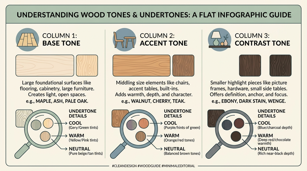
Mix wood tones successfully by following three rules: keep one dominant tone across about 80% of the room’s wood (usually the floor), choose clearly lighter or darker supporting tones rather than near-matches, and keep undertones consistent — warm woods with warm, cool with cool. When each tone repeats in at least two places and textiles separate the woods, the mix reads deliberate instead of accidental.
Matching every wood in a room looks flat and dated; scattering random woods looks chaotic. The middle path — a controlled mix of two to three tones — is what designers actually do, and it’s more forgiving than most people fear. This guide covers the rules, the science behind why woods clash, room-by-room applications, and a five-step audit you can run this weekend.
At a Glance
| Dominant wood | Best partners | Avoid |
|---|---|---|
| Warm oak / honey | Dark walnut, black-stained, rattan | Gray-washed mid-tones at eye level |
| Dark walnut / espresso | Pale oak, whitewash, cane | Medium cherry (the muddy middle) |
| Gray-washed / cool ash | Whitewash, black, sparing blonde oak | Orange pine, cherry, honey teak |
| Red-toned cherry/mahogany | Deep espresso, cream-painted, jute | Pale cool ash side by side |
| Pale Scandinavian floor | Espresso, black, woven textures | Two competing mid-browns |
How We Chose These Rules
- Practicality. Every rule works with furniture people already own plus one purchase.
- Undertone logic. The system relies on a repeatable 30-second test (white paper + daylight), not on designer-only color eyes.
- Forgiveness. Rules must survive real shopping — where “match the floor exactly” never happens.
- Style range. The combinations hold in modern, farmhouse, mid-century, and traditional rooms.
The Color Science of Wood (Why Woods Clash)
Understanding three facts about wood as a material makes every rule below feel obvious rather than arbitrary.
Wood has no single color — it has an undertone. Every wood carries a base hue beneath its brown: oak leans yellow-gold, cherry leans red, ash leans gray-yellow, walnut sits near-neutral with purple-brown depths. Two woods with the same darkness but different undertones (honey oak beside gray ash) clash harder than two woods with different darkness but the same undertone. That’s why “they’re both medium brown” doesn’t save a pairing.
Wood changes with age and light. The USDA Forest Products Laboratory documents how ultraviolet exposure darkens cherry dramatically, yellows pine, and grays any wood left unfinished. A mix that harmonized in year one can drift apart by year five — one more argument for keeping the number of tones low and the placement deliberate.
Finish multiplies the effect. Oil finishes warm and deepen; polyurethane cools and adds reflectivity; white-washing and graying washes subtract the warm undertone entirely. When auditioning a pairing, judge finished surfaces under the same light — comparing an oiled sample to a lacquered one misleads.
Finally, remember what the eye actually measures: contrast boundaries. Rooms read calm when wood boundaries are either clearly contrastive (pale against espresso) or essentially continuous (one tone). It’s the narrow in-between — two mid-browns differing just enough to notice — that registers as a mistake.
#1. The 80/20 Rule With a Dominant Anchor
Your unchangeable wood — almost always the floor — becomes the dominant tone. It and the largest furniture pieces carry roughly 80% of the wood visual weight. The remaining 20% is one or two deliberate contrast tones.
Why It Works
Rooms feel calm when a clear hierarchy exists. Without a dominant tone, every piece competes; with one, contrast tones read as accents rather than accidents. The 80/20 split also reflects reality: floors plus the two largest casegoods genuinely are most of the visible wood in a typical room, so the rule works with physics of the space rather than against it.
How to Do It
- Photograph your floor and fixed woods in daylight.
- Count your large wood surfaces (floor, largest casegoods) — this is your 80%.
- Choose dining chairs, side tables, or frames in one clearly lighter and/or clearly darker tone for the 20%.
Strengths
- Works with any starting point because the anchor is whatever you can’t change
- Instantly stops the “why does this room feel off?” problem
- Scalable: one contrast tone now, a second later, deliberately
Trade-Offs
- Limits how many statement wood pieces you can add later
- Requires editing: one rogue mid-tone can still disturb the scheme
Best For
Every wood-mixing project — start here before buying anything.
#2. The Undertone Test (Warm vs. Cool)
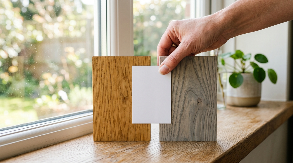
Hold a sheet of white paper beside each wood in daylight. If the wood reads yellow, orange, or red beside white, it is warm. If it reads gray, green, or ashy, it is cool.
Why It Works
Two woods clash when their undertones disagree, even if their darkness is similar — orange oak beside gray ash is the classic failure. Undertone consistency, more than shade matching, is what the eye reads as harmony. The white card works because it gives the eye a neutral reference: without one, brains color-correct woods toward “brown” and hide the difference until furniture sits side by side.
How to Do It
- Cut a pure-white card or use a white paint swatch.
- Hold it against the wood near a window — never under lamps, which tint everything.
- Sort your woods into warm, cool, and neutral columns before planning purchases.
- Take the card shopping: hold it against the floor photos on your phone, then against the candidate furniture in the store’s window light.
Strengths
- A 30-second test requiring zero expertise
- Explains clashes you already have, retroactively
- Works on photos too, if the lighting is honest
Trade-Offs
- Some woods (walnut, teak) sit near-neutral and flex either way — judgment still involved
- Daylight quality varies by season and window orientation; retest in the season you decorate
Best For
Anyone about to buy furniture against existing floors — run the test in the store with a white card and floor photos.
#3. Contrast, Not Cousins
With a mid-tone floor, add woods that are clearly lighter or clearly darker. Two mid-tones that almost match — but don’t — are what people perceive as “clashing.”
Why It Works
Clear contrast reads intentional; near-matching reads like a failed attempt at matching. A pale oak floor under an espresso table looks styled; the same floor under a caramel table looks like a mistake. The squint test makes it visible: blur your eyes and near-matches melt into one muddy mass, while a clear light-dark pairing keeps two crisp readable planes.
How to Do It
- Stand back and squint at the room — near-matches blur into one muddy mass.
- For each new piece, ask: is it clearly lighter or clearly darker than its neighbor? If the answer is “roughly the same,” skip it.
- When in doubt, jump two steps on the shade ladder rather than one.
Strengths
- Simple binary check anyone can apply
- Adds depth that single-tone rooms lack
- Photographs better — contrast registers even in dim evening shots
Trade-Offs
- High contrast schemes show dust and scratches sooner on the light pieces
- Very dark woods dominate small rooms — use them below eye level
Best For
Dining rooms and living rooms, where mixed tables and chairs are most common.
#4. The Textile Bridge (Soft Breakers Between Woods)
Rugs, upholstery, runners, and wall color placed between wood surfaces stop them from grinding directly against each other.
Why It Works
Adjacent woods compete at their boundary line. Interrupt the boundary — even with 3 in of jute, wool, or painted wall — and the eye processes each wood separately, forgiving differences it would have flagged as a clash. This is why the same two woods can fight in one room and coexist in another: the successful room had separation.
How to Do It
- Audit where wood touches wood: table legs on floor, dresser against baseboards, chairs against a wood wall.
- Insert a breaker: area rug under the dining set, runner along the kitchen floor, upholstered chair backs, even a tablecloth for high-tension zones.
- Wall color counts as a breaker too — a mid-tone painted wall sits between pale floors and dark furniture more gracefully than white does.
Strengths
- Rescues existing clashes without replacing anything
- Adds the comfort layers rooms need anyway
- Cheapest fix in the entire article
Trade-Offs
- Partial fix: bridging hides tension but doesn’t create the intentional look contrast gives
- Rugs and textiles need their own cleaning rhythm
Best For
Rooms you can’t repaint or refloor — and every first attempt before money is spent.
#5. Painted Furniture as the Neutral Escape
Cream, black, olive, and gray painted pieces read as color, not wood — they bridge tones rather than joining them.
Why It Works
Paint replaces the wood’s undertone with a chosen pigment, removing it from the warm/cool contest entirely. This is why designers specify painted casegoods in wood-heavy rooms: the painted piece absorbs tension instead of adding to it, and it can be repainted when the scheme evolves.
How to Do It
- Choose the tension point — usually the piece that matches nothing (inherited dresser, mismatched chair).
- Paint it a room-neutral: cream for warmth, black for contrast, olive or slate for depth.
- Keep some wood visible where it’s beautiful — paint the body, leave the top natural, or vice versa.
Strengths
- Converts a clashing piece into a bridging one for the price of a paint can
- Two-tone (wood + paint) pieces act as built-in bridges
- Fully reversible with another coat
Trade-Offs
- Reduces total visible wood — rooms needing wood warmth should budget for it elsewhere
- Chipped paint on high-use surfaces needs maintenance
Best For
Inherited and secondhand pieces that can’t be returned — and renters allowed to paint furniture if not walls.
Tools & Materials You’ll Need
Essential
- White paper or pure-white paint swatch for undertone testing
- Phone photos of fixed woods, taken in daylight
- One “bridge” item: jute rug, rattan, bamboo, travertine, or two-tone furniture
Optional
- Textiles to separate tones: runner, upholstery, tablecloth
- Black metal or cream-painted accents as neutral anchors
- Paint and primer if converting a clashing piece
The Five-Step Weekend Audit
- Photograph every wood surface in daylight — floors, doors, stairs, big furniture. Print or spread the photos on a table.
- Run the undertone test on each photo with a white card beside the real surface. Sort into warm / cool / neutral columns.
- Squint test the room. Identify the muddy middle — any pair of near-matched mid-tones.
- Choose your dominant (80%) — almost always the floor — and your one or two contrasts (20%).
- Make one intervention: bridge the worst boundary with a textile, or move one piece to another room. Live with it a week before buying anything.
Room-by-Room Application
Living rooms: anchor = floor; contrast = coffee table or media unit; bridge = rug under the seating. The trickiest item is the TV stand — black or painted media units sidestep the whole question beside wood floors.
Dining rooms: the highest-stakes mixing zone because tables and chairs interlock visually. Two reliable formulas: dark table + pale chairs, or pale table + dark chairs + a rug between table and floor. Avoid the matched dining set plus one random inherited chair — instead, paint the odd chair.
Bedrooms: bed, dresser, nightstands, and floor compete. The easy win: upholstered or painted bed frame removes the biggest wood from the contest; keep wood for casegoods in ONE contrast tone against the floor.
Kitchens: cabinets are the fixed 80%. Wooden counters or islands should either match cabinet warmth or contrast clearly; a wood floor and wood cabinets that near-match but differ in undertone (warm oak floor, gray-washed oak cabinets) is the most common modern kitchen clash.
Entryways and hallways: runners do the bridging; keep storage pieces painted in these transitional zones.
Real-World Examples: Three Rooms, Fixed
The near-matched dining room. Honey oak floors, a caramel-stained farmhouse table, six mixed chairs. The clash: table and floor differed by half a tone. The fix: a large natural-fiber rug under the table (the bridge), chairs painted cream with oak seats, and the table stayed. Cost: about $200 and a weekend.
The gray-and-orange living room. A gray-washed oak floor inherited with the house, warm pine furniture brought from the old apartment — the textbook undertone clash. The fix: the pine bookcase painted deep green (neutral-adjacent), the pine coffee table replaced with a black metal-and-glass piece, and warm textiles added so the room didn’t go cold. The floor now reads intentional.
The everything-walnut bedroom. Espresso floor, espresso bed, espresso dresser — flat and heavy rather than clashed. The fix: contrast, not replacement — pale oak nightstands and a cream rug lifted the room immediately, proving that “too matched” is its own failure mode.
Common Mistakes to Avoid
- Crowding the muddy middle — three mid-browns with no lights or darks is the most common clash in real homes.
- Mixing undertones (orange oak floors + gray-ash dining table) with nothing bridging them — if you must, put a rug and neutral textiles between.
- Forgetting the floor counts — often 40% of visible wood; shopping against the store’s warehouse floor instead of photos of yours.
- Treating painted furniture as a wood tone. Cream and black painted pieces are neutrals here — they bridge, not clash.
- Busy beveled LVP flooring — reads as multiple tones already; calm it with a larger rug before adding furniture tones.
- One of everything. A pale chair, a dark table, a mid shelf, and a red-toned stool is four tones with no repetition — the scheme never resolves.
- Ignoring aging. Cherry darkens, pine yellows: a mix tuned this year drifts. Fewer tones drift less.
Troubleshooting
- The room still feels off after following the rules. Check the wall color: a cool gray wall against all-warm woods creates a clash that no wood adjustment fixes.
- Two pieces you love fight each other. Separate them across the room rather than side by side, and bridge both with textiles. Distance lowers the stakes.
- The mix works in daylight, clashes at night. Your bulbs are too cool — swap to 2700K and rejudge. Wood warmth is partly a lighting effect.
- The floor is the problem (rented, ugly, unchangeable). Maximize rugs — cover 60–70% — and choose furniture that contrasts the remaining visible strips clearly rather than near-matching them.
Limitations and Trade-Offs
Three tones per room is the practical ceiling; more requires an experienced eye and heavy textile bridging. Species shift over time — cherry deepens and pine yellows with UV exposure (documented by the USDA Forest Products Laboratory) — so a mix that works today may drift warm in five years. Laminates that photograph a single species won’t behave like the real wood they imitate; judge the plank, not the label. And wall color sits outside this system but dominates it: fix the wall first if woods and walls disagree.
Practical Checklist
□ Anchor wood identified (floor or cabinets) □ Undertone test run in daylight for every wood □ One clearly light and/or one clearly dark contrast tone added □ Each tone repeats in at least two places □ Textiles separating floor from furniture at the hot zones □ Maximum three wood tones in view □ Squint test passed — no muddy middle □ Evening re-check under 2700K lamps
Regional Notes
United States: Builder-grade red oak and honey engineered floors dominate older stock — dark contrast furniture is the easiest win. New builds lean pale European oak, which forgives nearly everything.
United Kingdom: Victorian pine floorboards mixed with modern furniture is the norm; pine’s warmth pairs well with black accents and deep greens. Period homes also bring wood paneling and stairs into the equation — treat stair treads as part of the 80%.
Canada: Wide-plank maple runs cool and creamy — pair with whitewash and black rather than orange accents. Hemlock and spruce stock (BC) sit warm-neutral and flex both directions.
Australia: Warm-toned natives (blackbutt, spotted gum) anchor the coastal-modern look with pale linen upholstery and rattan. Strong UV accelerates drift on finished timbers — re-oil annually to keep the undertone you chose.
Expert / Official Guidance
- USDA Forest Products Laboratory: technical documentation of wood color changes with UV and aging — why cherry darkens and pine yellows.
- Stain and paint manufacturers (Minwax, Farrow & Ball): published undertone explainers used for the white-card test logic.
- ASID: pattern- and material-mixing principles underlying the 80/20 visual-weight hierarchy.
Frequently Asked Questions
How many wood tones are too many?
Three is the practical ceiling for most rooms. Collected, textured styles (modern organic, boho) sustain more — but only when every tone repeats and textiles separate them.
Do the floor and furniture have to differ?
No — matching works if contrast comes from elsewhere (black, color, texture). The failure mode is almost-matching, not matching.
Can I mix wood with painted furniture?
Yes. Painted wood reads as color, not tone, so cream, black, and olive painted pieces act as bridges between real woods.
Does the wall color affect wood mixing?
Enormously. Warm woods need walls with warmth (warm white, cream, muted greens); a cool gray wall against warm woods is a clash no furniture move fixes.
How do I mix woods in an open-plan space?
Treat the whole floor as the anchor and keep ONE contrast scheme across every zone — changing wood strategy between the kitchen and living areas creates a new clash at the boundary.
My laminate floor photographs like wood but looks flat — does it count?
It counts at 80% dominance the same as wood, but its printed tone won’t age or accept the same bridges: lean on rugs and contrast furniture, and skip refinishing fantasies.
Final Takeaway
Test undertones with a white card, crown your unchangeable wood as the dominant tone, and add one clearly lighter and one clearly darker partner. Repeat each tone twice, separate woods with textiles, and cap the room at three tones. Recheck under evening lamps, because wood warmth is half lighting. That system turns mismatched wood from a problem into the room’s best feature — and it costs nothing to start with the audit this weekend.